BA3a Week 2 - Task 1
With the bake done it was now time to focus on the UI design of the displays. I figured I would spend a bit extra time developing these since they will be a big part of the story telling in this texture.
I started off by creating what every hotel has, a logo. Since the hotel is a Cryo Freeze hotel I wanted the theme of the logo to reflect this. As inspiration I found this great abstract logo:
Logo Inspiration
I really liked how clean and professional the design was and also futuristic and that's exactly what I wanted for my hotel logo so from this I created my own design inspired by that logo.
My logo, inspired by the reference above
With the logo complete it was now time to focus on the UI design. My inspiration for this was again from the movie "Oblivion" which have amazing and clean UI throughout the film. I started off by creating a mood board of their UI.
Mood board with UI design from the film "Oblivion"
While creating my UI using the moodboard as inspiration I also had to keep the story of my environment in mind, that the station had been breached and that the guests of the hotel had been locked into their "Rooms" for a period of time. Another challenge I had to overcome was the repetition aspect of the texture. How every "room" will have the same UI on them so therefor I could not assign a specific guest because then all the rooms would have the same guest on the monitor which would be a bit odd. To prevent this I added that the server could not be reached which fits the story and also combats the issue of repetition.
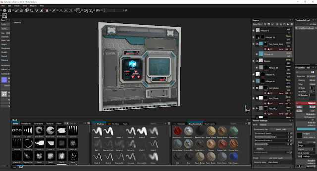
With the UI complete it was now time to bring the model into Substance Painter for texturing. This was a rather straight forward step where I mixed various different materials to achieve the result I wanted. I used the same technique to create the floor but since most of the focus would be on the wall I didn't want to add too much detail.
One of the issues I encountered while texture this piece was that the back panel was too empty, to solve this I added a hexagonal pattern which fit very well with the theme and was a rather easy change to add in substance.
One of the issues I encountered while texture this piece was that the back panel was too empty, to solve this I added a hexagonal pattern which fit very well with the theme and was a rather easy change to add in substance.
To get an idea of how the texture would look like in a properly rendered environment and with all the lights I did a preview in Marmoset before start my work on the dirty version.
When I was satisfied with the clean version I started working on the dirty version. For this version what I did was adding blood, damages and also added some storytelling to the glass window to enhance the idea of someone being stuck inside of it.
With both the clean and dirty version done of the textures it was time to include them in UE4. To make sure I do the vertex painting correctly I watched several tutorials to demonstrate how to use it.
By following the tutorials this was my final texture setup, ready for vertex painting.
And now for some final screenshots of the scene in Unreal Engine 4 with vertex paint applied to combine the clean and dirty version.
Overall I am rather happy with the result, although I don't think this texture would be useful within a game unless you add some geometry to make some parts stick out cause now if you inspect it from the side it's very flat and the illusion breaks rather easily. It was some great practise tho and learnt how vertex painting works which will come very handy for my main project.


No comments:
Post a Comment